CAPE
UX Techniques
Information Architecture, Prototyping
Background
Cost Assessment and Program Evaluation (CAPE) is an office within the U.S. Department of War (DoW) that advises the Secretary of Defense on defense program costs, resource allocation, and future force needs.
Problem
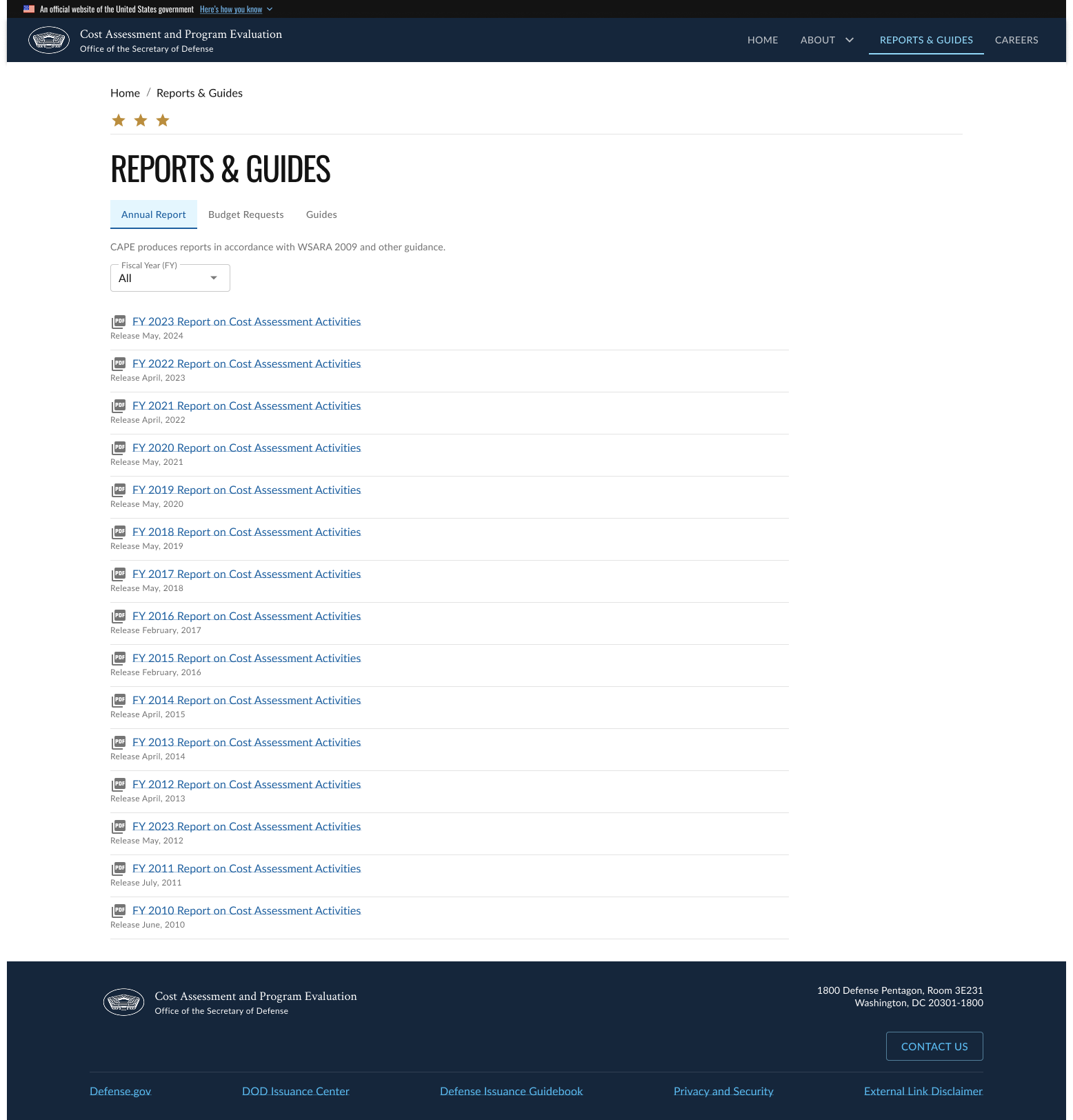
The legacy website was visually outdated, with all content crowded onto a single page, making it difficult to navigate and absorb information effectively. The original design lacked clear hierarchy and modern visual cues, which adversely affected usability and overall credibility. Additionally, the site did not adequately address accessibility best practices, such as readable contrast, keyboard navigation, and support for assistive technologies, limiting its usability for a wider audience.
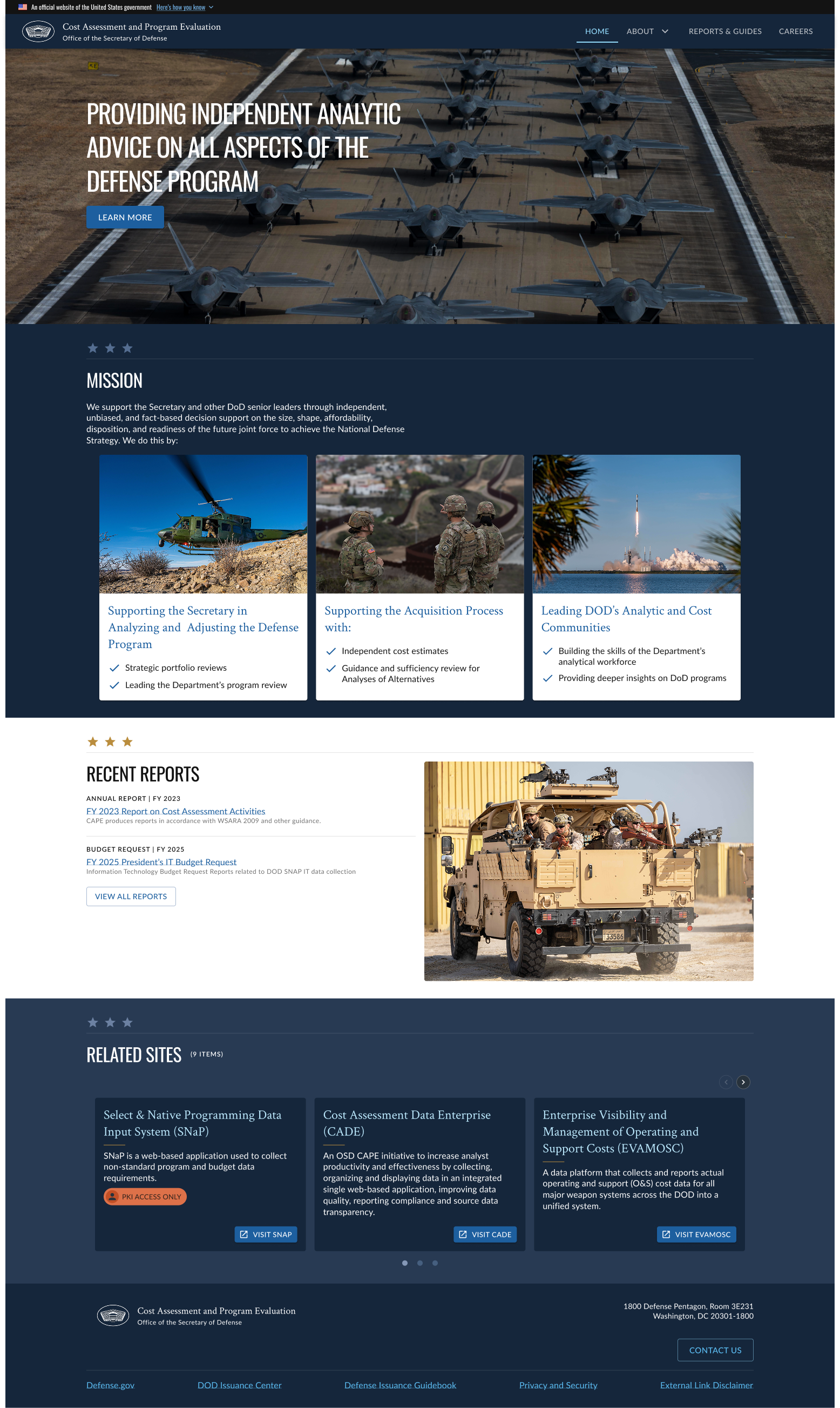
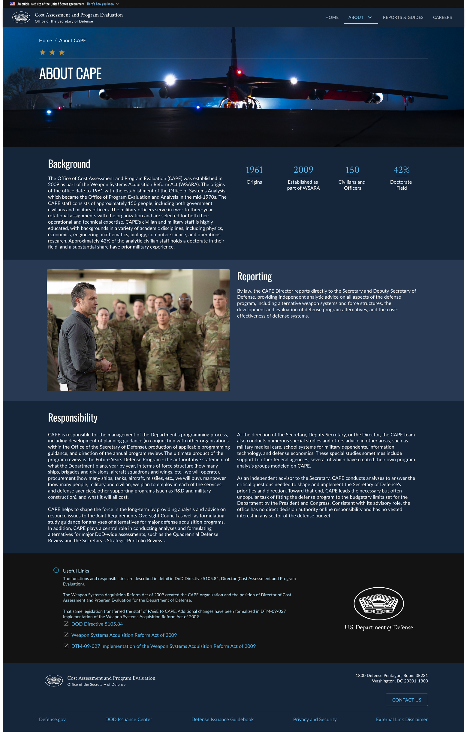
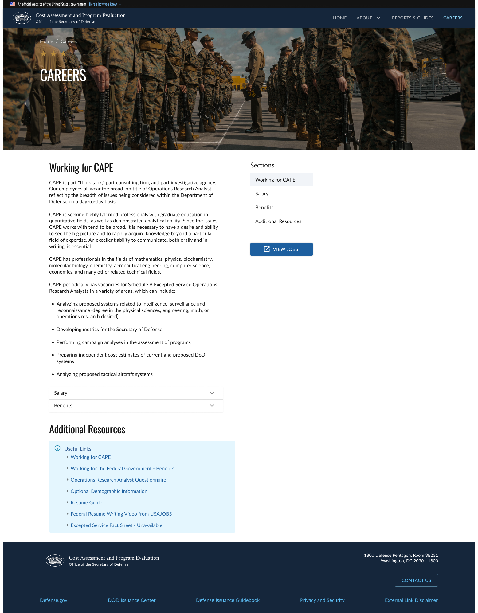
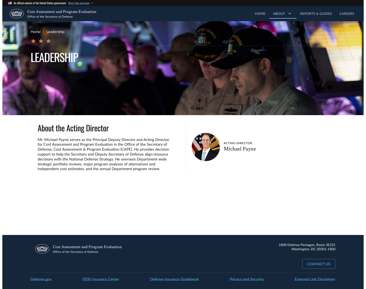
Solution
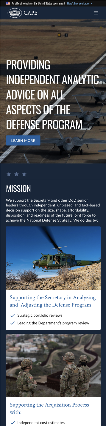
The solution focused on modernizing the website’s look and feel while restructuring the content into clearly defined, separate pages to improve navigation and clarity. A refreshed visual design introduced consistent typography, spacing, and visual hierarchy, making the site easier to scan and more engaging. By organizing information logically and enhancing usability, the updated site allows users to find content more efficiently and interact with it more intuitively across devices.
Outcome
Improved usability and efficiency: The final designs improved usability and navigation, allowing users to find information quickly and with less effort.
Improved branding and aesthetics: The final designs provided users with a modern, visual appealing website that enhanced CAPE’s credibility and user trust.
Accessible and response: With accessibility in mind, users were now able to use mobile devices to navigate the website seamlessly and use assistive technologies.